When we talk about trucks, besides their powerful engines and superior carrying capabilities, brand logos are an indispensable part, contributing to the identity and recognition of each manufacturer. In the bustling Vietnamese market, truck brand logos are not just symbols, but also carry unique stories, values, and business philosophies.
This article by Xe Tải Mỹ Đình will take you on a journey to explore the diverse world of logos of popular truck brands in the current market. We’ll delve into the meaning behind each symbol, its development history, and how it contributes to building the unique identity of each brand.
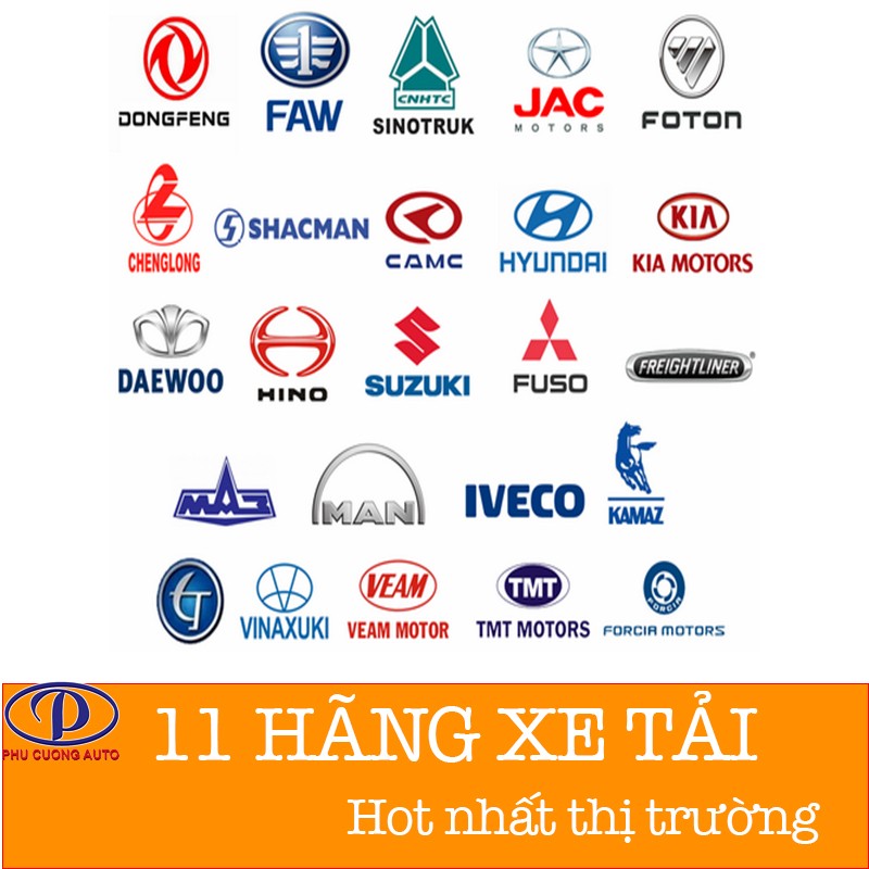 Overview of popular truck brand logos in the Vietnamese market
1. Wuling Truck Logo: An Elegant “W”
Wuling, a truck brand from China, is increasingly asserting its position in the Vietnamese market thanks to its compact and flexible trucks. The Wuling logo is a stylized “W”, designed simply but with sophistication and modernity.
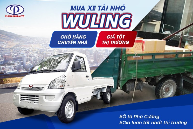 Stylized "W" logo of Wuling truck brand
The “W” in the Wuling logo is not just the first letter in the brand name, but also symbolizes steadfastness, reliability, and win-win, reflecting Wuling’s commitment to delivering quality products and collaborating with customers for mutual growth. The minimalist and easily recognizable logo design is suitable for the development orientation of small trucks, serving the need for flexible goods transportation in urban areas.
 Wuling truck with tarpaulin and prominent "W" logo
2. Faw Truck Logo: A Soaring Eagle
Faw (First Automobile Works), a long-standing and leading automobile group in China, brings a diverse range of trucks from light to heavy-duty to the Vietnamese market. The Faw logo is an image of a powerful soaring eagle, symbolizing the aspiration to reach far and conquer.
 Soaring eagle logo of Faw truck brand
The eagle image in the Faw logo represents strength, speed, and foresight. The wide-open wings symbolize continuous development, striving to be a leader in the automotive industry. The dominant colors are usually silver or gray, bringing a sense of luxury, modernity, and reliability. The Faw logo is not only a brand symbol, but also an affirmation of the quality and class of Faw trucks in the international market.
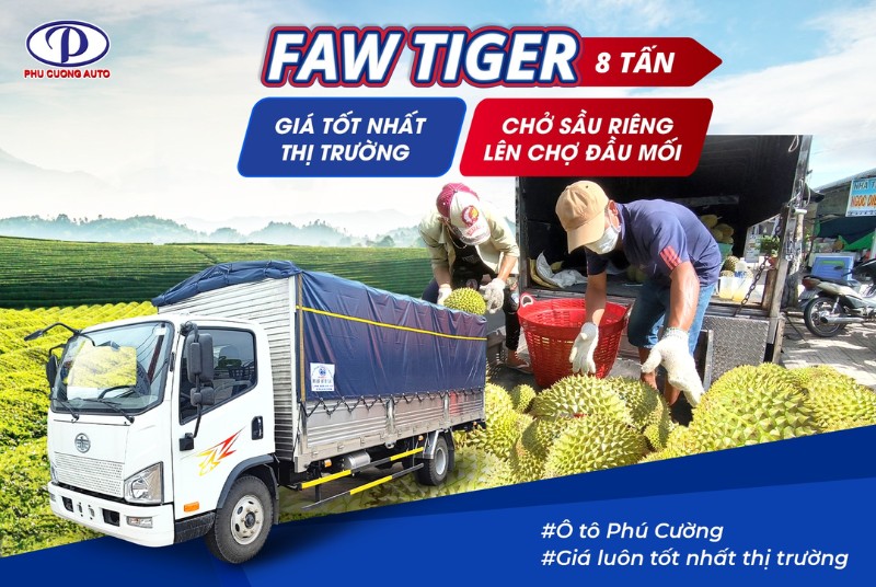 Faw Tiger truck with a powerful eagle logo
3. Jac Truck Logo: Five-Pointed Star
Jac (Jianghuai Automobile Co., Ltd.), another major truck brand from China, is known for its quality trucks in various segments. The Jac logo is a red five-pointed star, a familiar and meaningful symbol.
 Five-pointed star logo of Jac truck brand
The five-pointed star in the Jac logo symbolizes the five core values that the brand pursues: Quality, Technology, Environment, Energy Saving, and Safety. The red color of the star represents enthusiasm, passion, and dynamism. The Jac logo gives a feeling of trust, stability, and professionalism, suitable for the sustainable development orientation and quality commitment of the truck manufacturer.
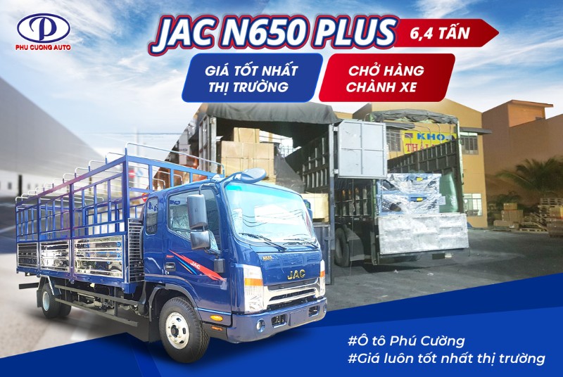 Jac N650 Plus truck with a prominent five-pointed star logo
4. Dongfeng Truck Logo: Dragons Facing the Moon
Dongfeng, one of the “four pillars” of the Chinese automotive industry, possesses a unique logo that carries strong Eastern cultural values: the image of dragons facing the moon.
 Dragons facing the moon logo of Dongfeng truck brand
The Dongfeng logo represents the power and majesty of the brand. The dragon image symbolizes strength, power, and good luck in Eastern culture. The moon in the middle symbolizes perfection, eternity, and the aspiration to reach the top. The Dongfeng logo is not only a brand symbol, but also a harmonious combination of tradition and modernity, reflecting the unique identity of the truck manufacturer.
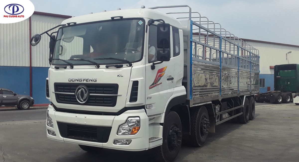
 Dongfeng truck with an impressive dragons facing the moon logo
5. Nissan Truck Logo: Nissan Name and Red Sun
Nissan, a globally renowned Japanese automobile brand, has a simple but easily recognizable logo: the brand name “NISSAN” placed in a red circle.
 Nissan name and red circle logo
The Nissan logo combines text and image in harmony. The word “NISSAN” is written in capital letters, strongly, representing reliability, quality, and brand reputation. The red circle symbolizes the sun, a symbol of Japan, enthusiasm, and energy. The Nissan logo gives a feeling of stability, durability, and Japanese quality, values that have made the brand famous worldwide.
6. SRM Truck Logo: Stylized SRM Letters
SRM (Shineray Motor), a large automobile group in China, brings to the Vietnamese market the SRM light truck line with European-style front design. The SRM logo is a stylized “SRM”, creating a unique and modern shape.
 Stylized SRM letters logo of SRM truck brand
The SRM logo uses the abbreviation of the brand name, but is designed with soft, graceful, and sophisticated lines. The letters “S” and “R” are linked to form a unified block, representing connection, cooperation, and sustainable development. The SRM logo gives a feeling of youthfulness, dynamism, and modernity, suitable for the positioning of light trucks, targeting young customers and small and medium-sized enterprises.
7. Dongben Truck Logo: DB Letters and Ellipse
Dongben, a domestic Chinese truck brand, has a simple, easy-to-remember logo: the letters “DB” (abbreviation of Dongben) placed in an ellipse.
 DB letters and ellipse logo of Dongben truck brand
The Dongben logo focuses on simplicity, directness, and easy recognition. The letters “DB” are written in capital letters, clearly, representing the brand name directly. The surrounding ellipse creates a feeling of stability, solidity, and comprehensiveness. The Dongben logo, although not elaborate, still conveys the message of practicality, reliability, and suitability for the actual usage needs of customers.
8. Suzuki Truck Logo: Stylized S Letter and Brand Name
Suzuki, a famous Japanese car brand, has a familiar logo with a stylized red “S” and the brand name “SUZUKI” in blue.
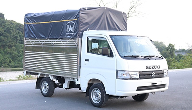 Stylized S letter and Suzuki brand name logo
The stylized “S” in the Suzuki logo is designed to be soft, graceful, and unique, creating a distinctive mark. The red color of the “S” represents enthusiasm, passion, and dynamism. The blue “SUZUKI” brand name gives a feeling of trust, sustainability, and advanced technology. The Suzuki logo is a symbol of the combination of tradition and modernity, Japanese quality, and constant innovation.
9. Hyundai Truck Logo: Slanted H in an Ellipse
Hyundai, a leading automobile group in Korea, has a slanted “H” logo placed in an ellipse, a symbol that has become familiar worldwide.
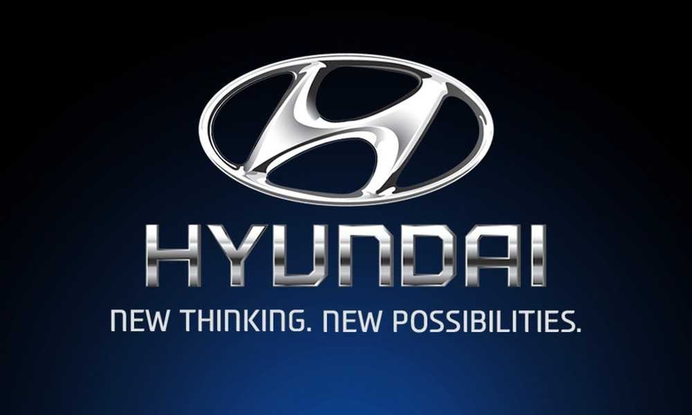 Slanted H in an ellipse logo of Hyundai truck brand
The slanted “H” in the Hyundai logo is not just the first letter in the brand name, but also symbolizes the handshake between customers and the company, representing trust, cooperation, and strong relationships. The ellipse surrounding the “H” symbolizes globalization, continuous development, and the broad vision of Hyundai. The Hyundai logo gives a feeling of modernity, dynamism, and reliability, reflecting the brand’s position in the international market.
10. Isuzu Truck Logo: Blue ISUZU Letters
Isuzu, a Japanese truck brand with over 100 years of history, has a simple but powerful logo: the word “ISUZU” in blue.
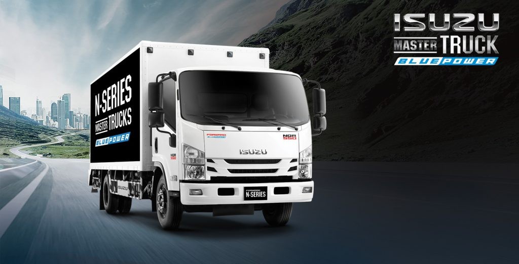 Blue ISUZU letters logo
The Isuzu logo focuses on clarity, directness, and readability. The word “ISUZU” is written in capital letters, strongly, representing the certainty, durability, and superior quality of Isuzu trucks. The blue color of the logo gives a feeling of trust, professionalism, and environmental friendliness. The Isuzu logo is a symbol of reputation, experience, and Japanese quality that has been affirmed over time.
11. Chien Thang Truck Logo: Circle and Star
Chien Thang, a Vietnamese truck brand, has a logo combining a circle and a star, imbued with national spirit.
 Circle and star logo of Chien Thang truck brand
The Chien Thang logo uses the image of a five-pointed golden star on a red circle background, reminiscent of the Vietnamese national flag, expressing national pride and attachment to the country. The star symbolizes strength, will, and the aspiration to rise. The circle symbolizes longevity, sustainable development. The Chien Thang logo gives a feeling of closeness, friendliness, and reliability, suitable for the development orientation of trucks serving domestic transportation needs.
Above is a detailed summary of the logos of 11 typical truck brands in the Vietnamese market. Each logo carries its own story and meaning, contributing to creating a unique identity for each brand. Hopefully this article has brought you interesting and useful information about the world of truck logos.
If you are interested in choosing a truck that suits your business needs, please contact Xe Tải Mỹ Đình immediately for the best advice and support:
PHU CUONG AUTO MECHANICAL ENGINEERING CO., LTD
Inbox or call the Hotline: 0906.818.006 (all days of the week)
[Detailed information on Phu Cuong Auto showrooms]
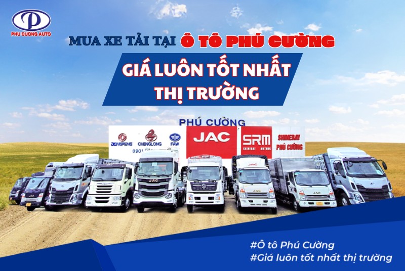
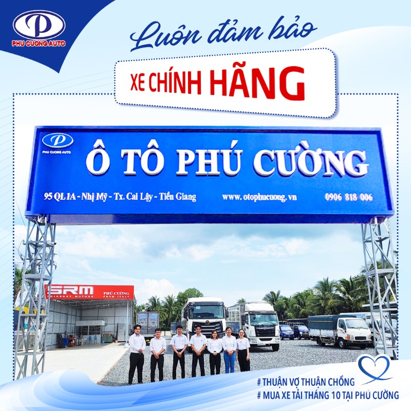 Image ensuring genuine vehicles at Ô tô Phú Cường
Why should you choose to buy a truck at Xe Tải Mỹ Đình – Phú Cường Auto?
[List the advantages of Phu Cuong Auto as in the original article]
In particular, Xe Tải Mỹ Đình is having a huge promotion program [Promotion information as in the original article]
[Contact information and promotional images as in the original article]
Otophucuong.vn
(Article updated: 12/02/2025)